Typography
Student Work | Typography | Layout Design
The two magazine layouts were created for my Typography class. As students, we were tasked with laying out the same magazine article in two different ways.
These two layouts are a nice addition to my portfolio and showcase my abilities for print layout. The photos of the planets were ethically sourced, and refined in Photoshop in order to give them an otherworldly feel fit for the subject matter. An understanding of sound typographical principles are on display with the choice of headline and body fonts working with color to create an appropriate and effective typographical hierarchy - seen in the title and byline, as well as the pull-quotes. It also shows an understanding of InDesign as used to flow text around the planet(s) in an interesting and dynamic way. Other tools of InDesign were used to control the leading and kerning in order to harmoniously fit the copy within the spread while avoiding typographical pitfalls such as rivers and orphaned words.
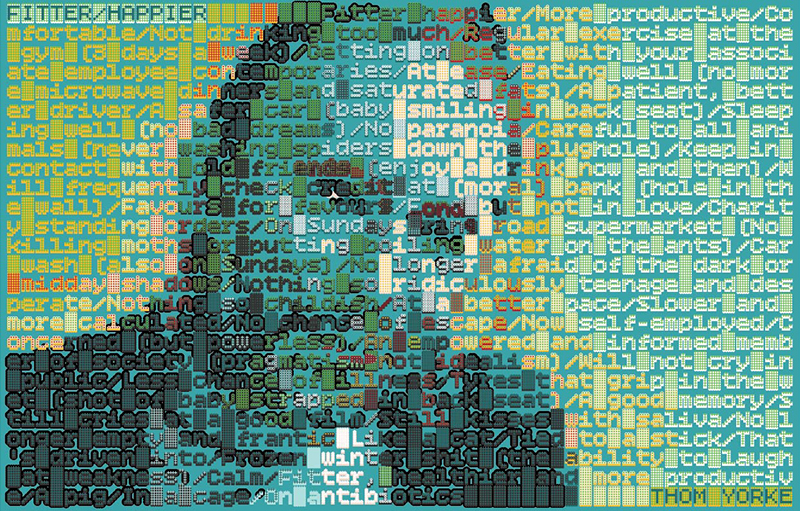
Also under the banner of typography - and from the same class - is the typographical portrait of Thom Yorke. My approach to this assignment was rather unique from my classmates, due to my chosen font of Bitcount. This dynamic monospace bitmap font presented a wonderful way to layer variation of the font on top of each other, while mixing the various individual pixel shapes of the font. Color is used to create form, and my understanding of color mixing is on display here.


