

Al's Escape To Spring Campaign
Professional Work | Sub Branding | Print Design | Digital Design
February kicked off the spring season at Al’s, and we always started with our huge Escape To Spring sale. This sale required its own style guide and the creation of lots of marketing material.
The quad-folded mailer showcases my layout abilities, as well as understanding how to create print-ready files that fit into the specifications of the printer and the US Postal Service. The mailer itself is designed with the user’s experience in mind, as the mailer unfolds to tell the story of early spring and the sale happening at the garden center. The mailer also includes my own photography, as well as manufacturer photos and a few stock images. The mailer adhered to the campaign style guide in order to maintain consistent branding throughout the store and the marketing material.
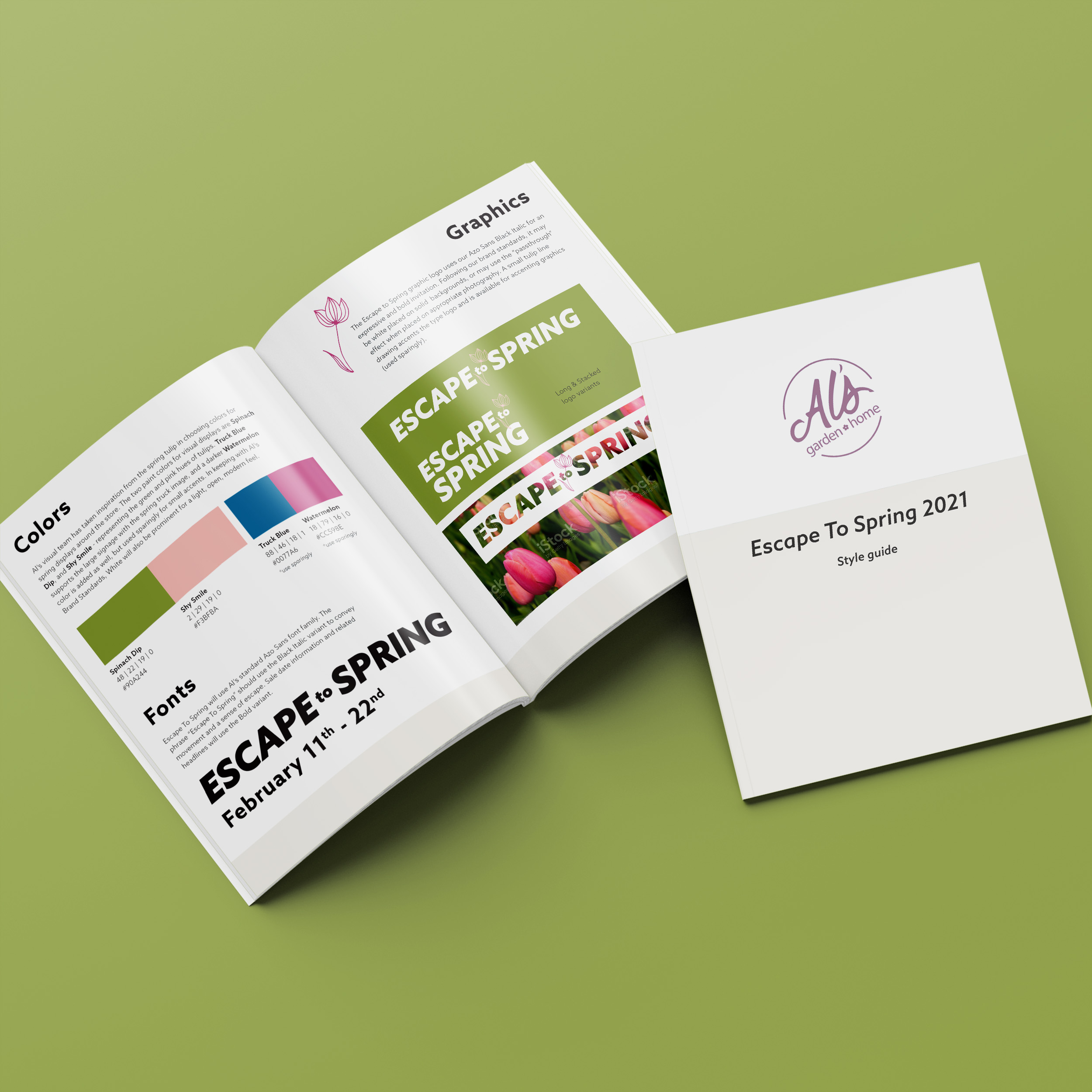
Also included here for my portfolio is the 2021 Escape To Spring style guide. Working with the Visual Director - the person in charge of the overall look of the interiors of the store - I created the style guide to include the inspiration for the campaign as well as the color palette, photography standards, fonts, and graphics. The colors and visual elements were repeated throughout the store displays, special end caps, and hanging store banners.The guide also showcases the unique signage templates created for the campaign: smaller sale signs as well as larger point-of-purchase A-frame signs. It also shows the larger hanging banners that were hung from the ceiling throughout the store, all created with InDesign. Digital design is on display as well, showing examples of web rotators, web ads, and marketing emails.